This week, our intern Marthe Huser-Daehlie writes about some of her favourite artworks in the Art Collection at Stirling.
Art is very personal and yet inclusive to all. We immerse ourselves into different platforms of art daily and sometimes without knowing it. Everywhere we look art exists, thought and process has been used to make it into a reality. Art on canvas or similar for example is a great mode of art to inspect and make an opinion upon. For the work is right in front of you with nothing to hide.
For me art of any kind has always been exciting, holding ample of possibilities to what it could mean. Since I can remember I have always looked at art and seen what’s in front of me with everything else fading away. Paintings have an ability to communicate true feelings, whether through colour, brush strokes or chosen topic. Sometimes artwork has no specific motive or reason for what is created but you alone can find a way to understand what is in front of you.
Since commencing my internship for the University of Stirling, Art Collection, I have spent hours sifting through the works collected and achieved within their database. Although housing numerous works, the following artworks have made an impact on me and have easily become my favourites.
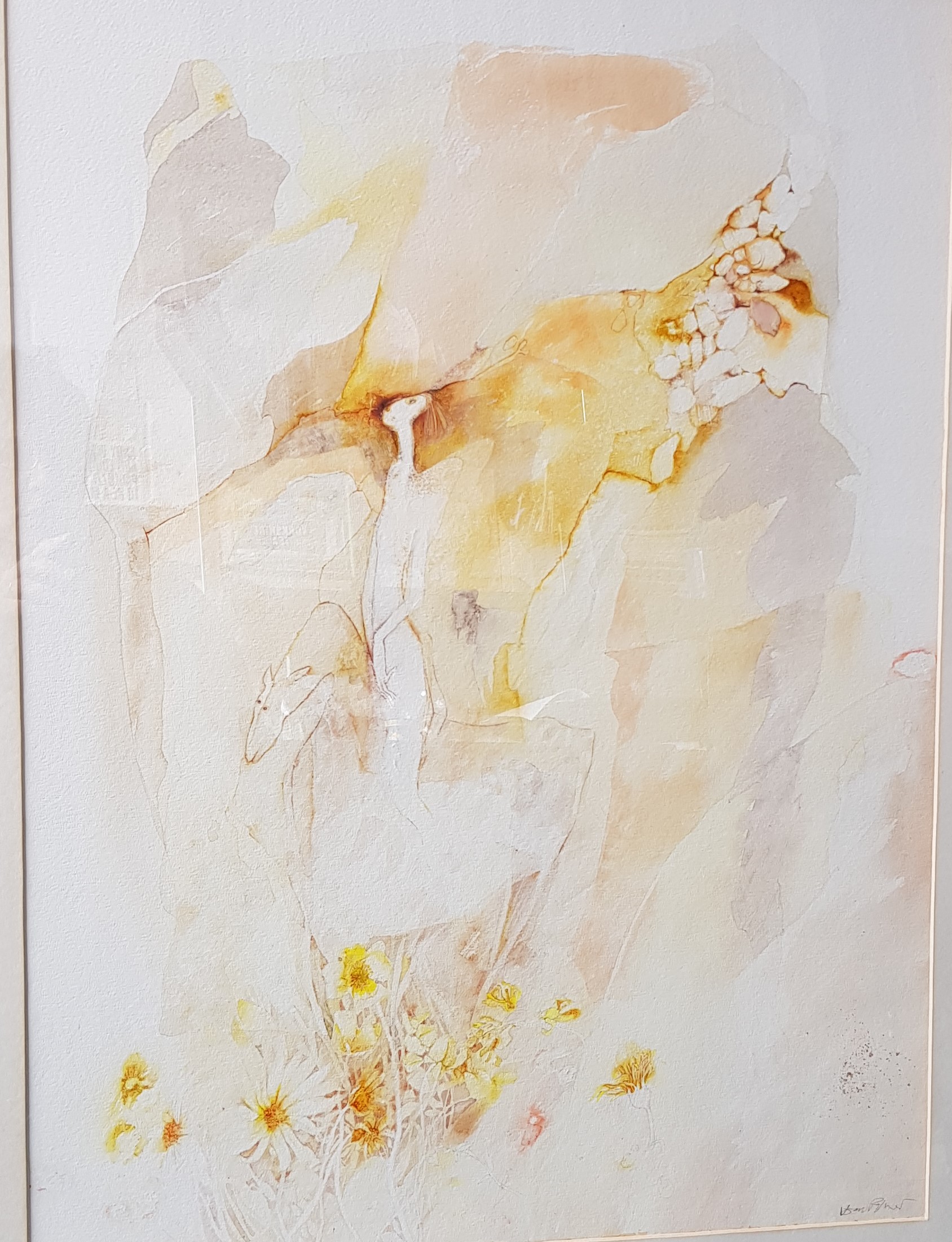
(Watercolour)
- Road to Samarkand by Joan Palmer (1941-1984)
A stunning watercolour including variants of orange, yellow and purples. A large pastel influence is present especially surrounding the outer boarders of the painting. Delicate artistry and precision have been used upon the strokes of the flowers at the bottom of the painting. Here we can see the evident relationship between paint and light. The shapes of the petals of the flower and the centre demonstrates a gradient layering of the yellow and orange tones. One can even speculate that the petals have been pressed onto the canvas. There is a delicateness and dramatic unity upon the positions of the flowers. The figure on the animal, presumed to be a horse, gives a domineering appeal to the viewer. Presuming to be that of a woman, the composition of her hands and body structure is rather delicate and intriguing.
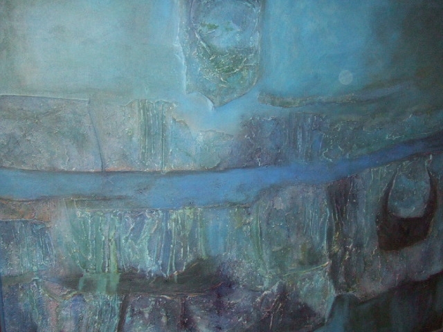
(Polyvinylacetate on canvas, 1960s)
2. Blue on Blue Alastair Michie (1921-2008)
As the son of Anne Redpath, Alastair Michie’s talents seem worthy from this alone. Yet with this impressive parentage his work is of its own value and cements his own abilities. This stunning unified painting encompasses brilliant shades of blue. It is hard not to conform to the emotional saying ‘feeling blue’ when looking at the painting. Although a saying that triggers the association to depression and has a place within the works of Picasso and his blue movement. This painting delivers both raw emotions of dejection but also of nature and its natural forces. It is a painting that can be interpreted in many ways, for me I see a sold line of uniformed blue acting as a parting for two sides. The texture alone delivers such a thoughtful execution of placement it is hard to not inspect and give a thought to what it may signify. It is an eye-catching painting that deserves much more awareness not just for the bold colours but for its underlining sophistication.
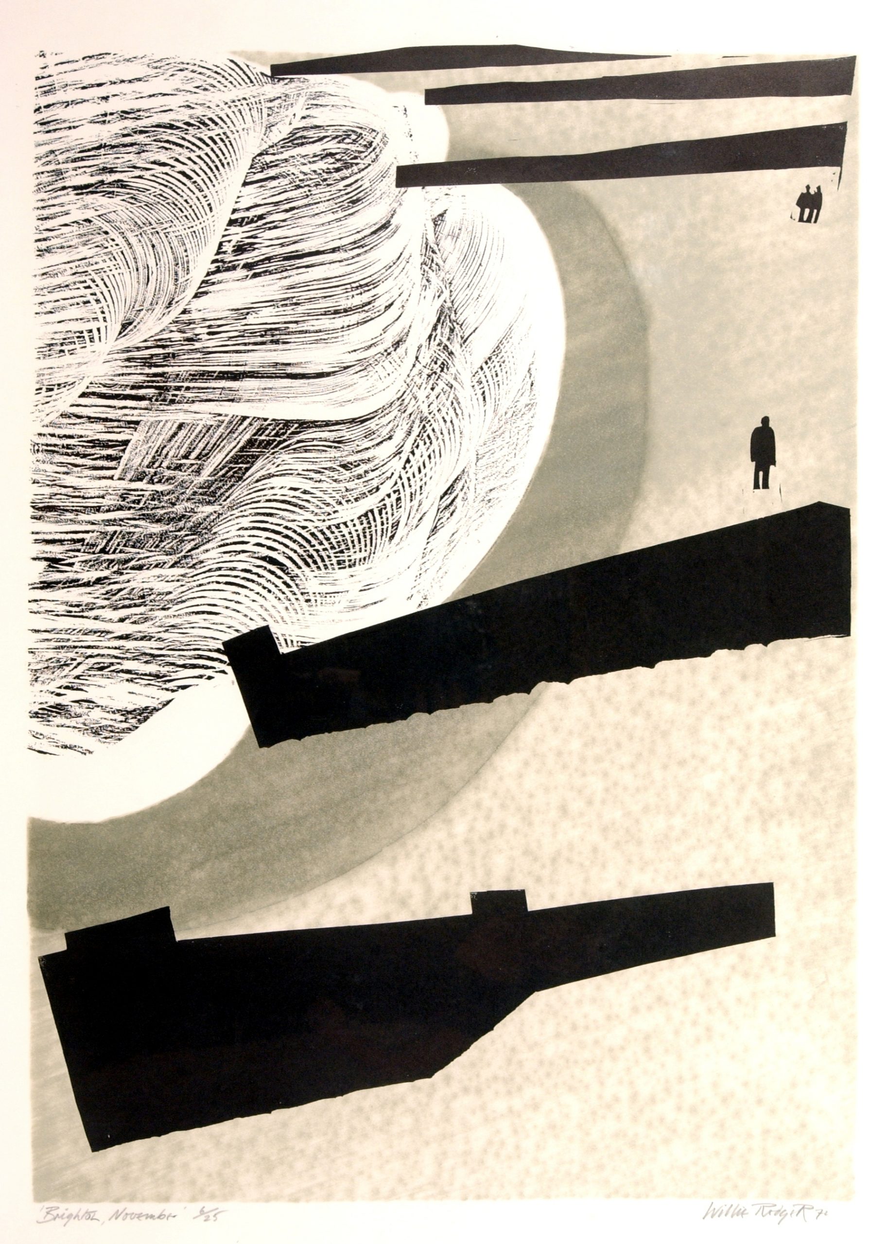
(Woodcut and linocut, 1972)
3. Brighton, November Willie Rodger (1930-2018)
This print is one of my all-time favourites, not just because of what has been created but because to me woodcuts and linocuts are in my opinion some of the best methods of creating art. I can see the cuts and angles that have been used to create this work, I can see in front of me the wood block and lino slab upon which Willie Rodgers engraved his thoughts. This work depicts British beach culture fully, for it is winter yet people cannot resist visiting the seaside. Not long ago the most common recommendation from doctors was you should get some sea air; it will make you feel better. That is what I see in this print. Rodger’s technique shows experience and faith, the use of random tools to create this work demonstrates the vastness of art. The distance of this print is not lost on me, especially within our current climate. The separation caused by the partitions on the beach again delivers loneliness. The colour pallet for the print is muted and by this use shadowing and conveying distance is heightened. I truly adore this print even though its message is bleak, but I think that’s why I like it so much.
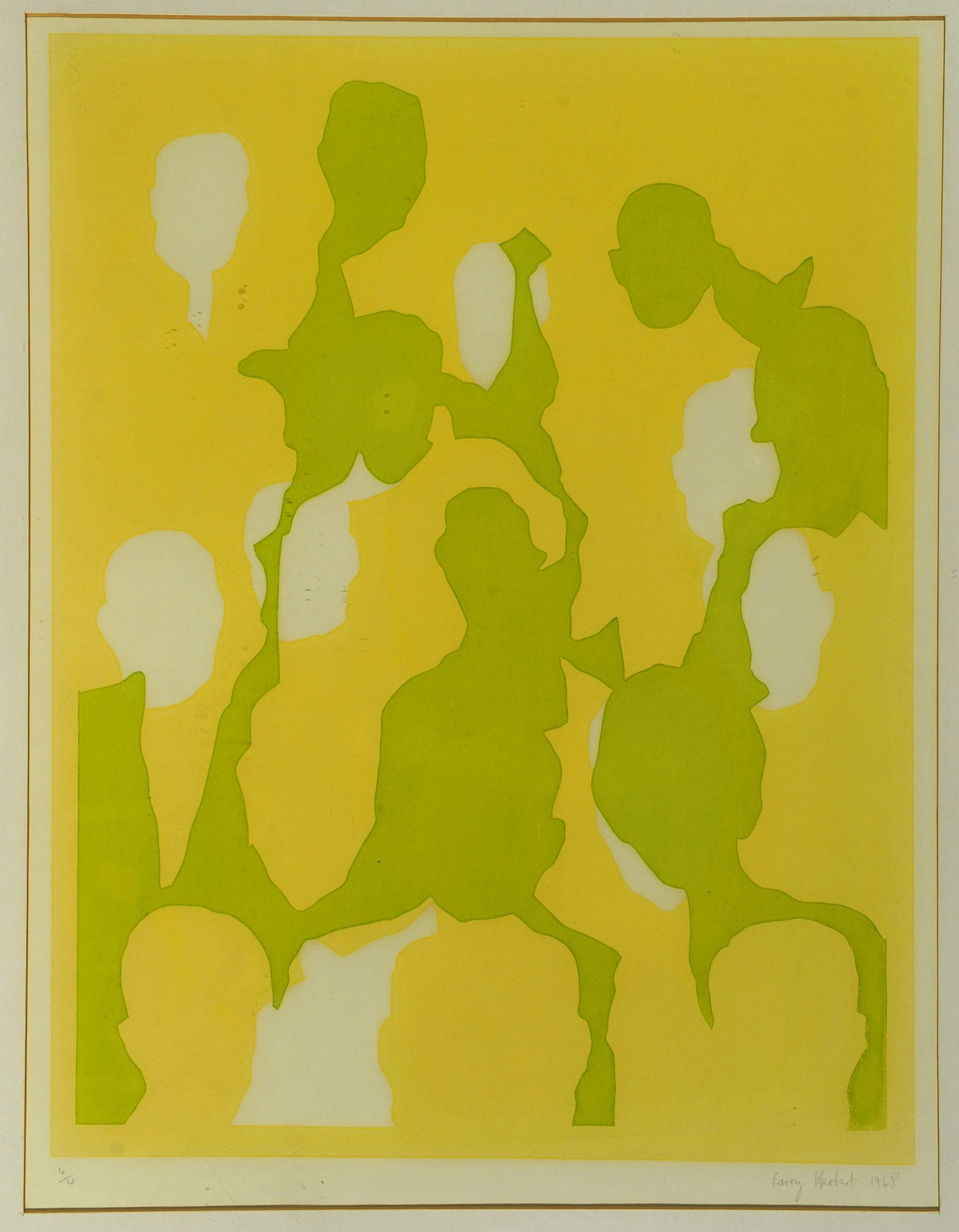
(Screenprint, 1968)
4. Untitled (Yellow, lime green and white) Barry Herbert (1937-)
An artist of great talent, Barry Herbert has had his work exhibited at world renowned locations and venues such as The Serpentine Gallery, Miami Biennale, and The International Triennale. Herbert’s works are a collective of drawings and prints, with the aim of conveying his views, this includes not conveying seriousness.
As Barry Herbert himself proclaims, the subjects of his prints change frequently. Regardless there is still a running theme from one print to the next. This print caught my eye not because of my liking for green or yellow, but together Herbert has managed to create something quite subtle yet unifying. The figures are spread out generously and overlapping, thus a crowd has emerged. Printing is a multi-step process that allows for experimentation of colours, technique, and mediums. When I think of contemporary works I look towards this image as a true example. Contemporary is a wide field within art yet for me this is truly a great example and showcases the diverse concepts of ideas, inspiration and method that goes into a work.