A newly installed display in Gallery One of the Pathfoot building showcases a collection of prints from the Dundee Contemporary Arts (DCA) Print Studio “2020 Editions” portfolio. These prints were created by artists who have worked with DCA across the years since they opened in 1999, and were conceived to mark the extraordinary challenges of the titular year, as well as supporting DCA’s recovery from the ongoing crisis gripping the cultural sector. Here we take a look at the individual works in the collection.
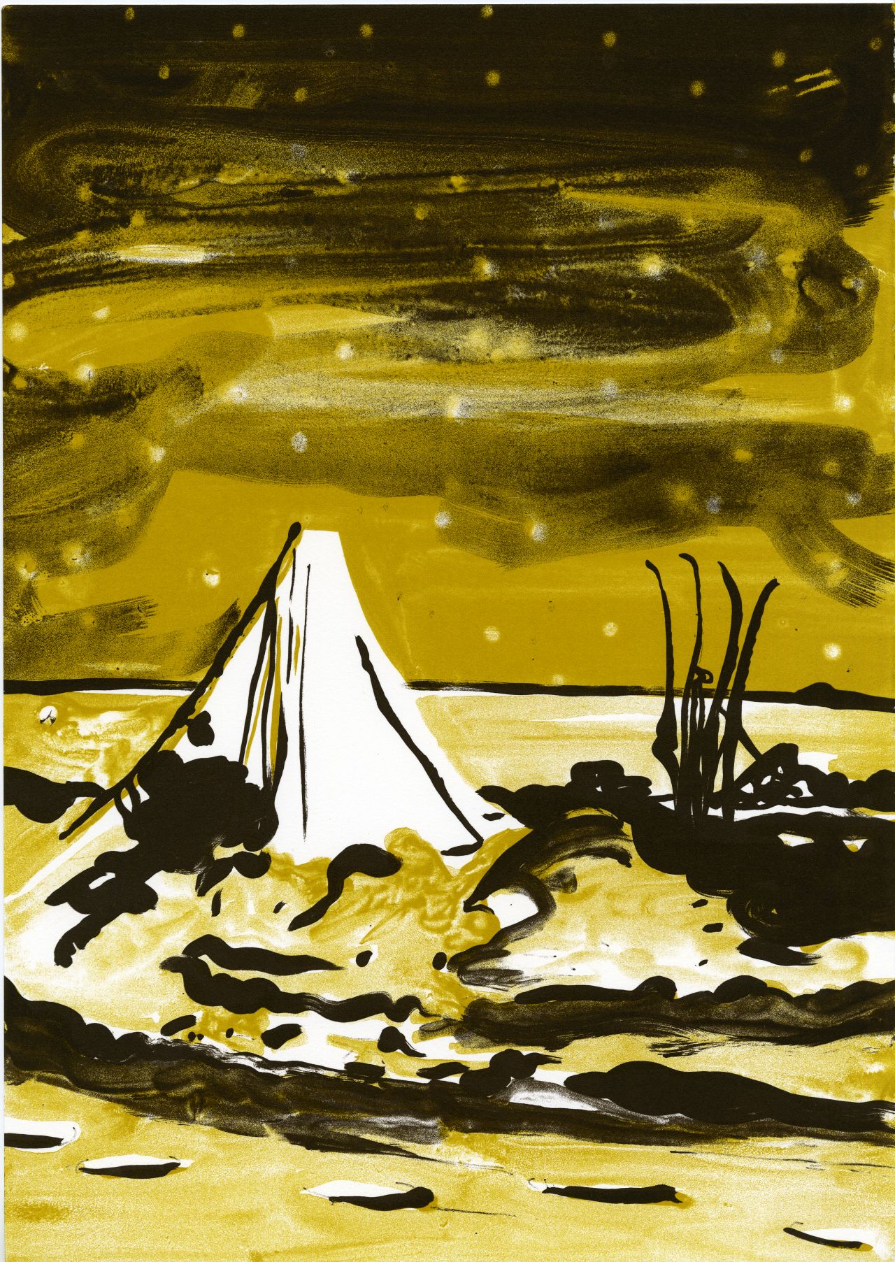
(Screenprint, 3/30, 2020)
This print is a companion piece to a lithograph from Woods’ 2017 solo show Victims of Geography. That litho, entitled The Optimist, shows the face of Captain Robert Scott before his ill-fated Antarctic exhibition in 1910. This new work shows us the expedition’s tent as it was discovered by Norwegian explorer Tryggve Gran, where he found the bodies of Scott and his fellow explorers, Edward Wilson and Henry “Birdie” Bowers, in which they had perished after being trapped in a blizzard.
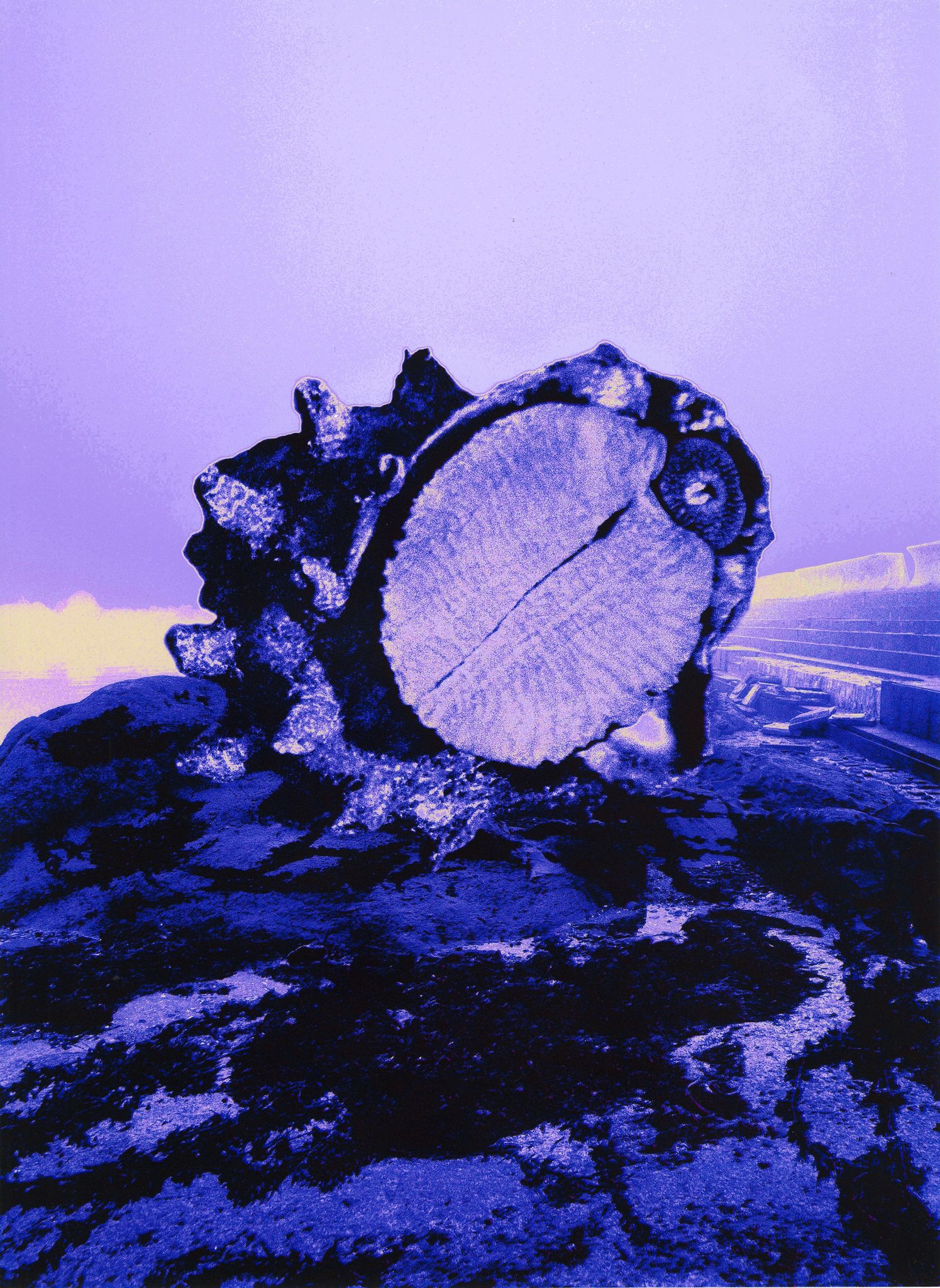
by Ilana Halperin
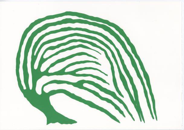
(Woodblock print with intaglio litho relief ink, 3/30, 2020)
Part of The Rock Cycle, a cross disciplinary project between Japan and Scotland that has been curated by Naoko Mabon/Wagon, this piece is based on the concept of the geological rock cycle, the process that describes how rocks change from one type to another over vast geological timescales, specifically thinking about the famous limestone of Akiyoshidai, Japan. Halperin adds the artistic twist of imagining a biological stage in the rock cycle, picturing the rocks as having first started as corals that transformed over the years, drawing connections between the materials that make up our teeth and bones and the similar structures in the geology around us.
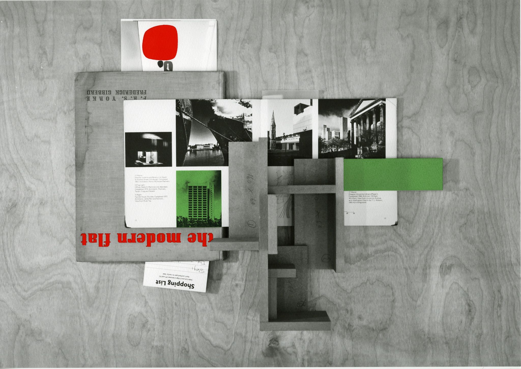
(Digital print, 3/30, 2020)
This work was conceived during lockdown when artist Toby Paterson found himself confined to his flat in Dundee. The prolonged and intense engagement with the same environment birthed new perspectives and ideas from the previously familiar, and this collage is an attempt to generate something tangible from a disconnected time. At the heart of the artwork is The Modern Flat, a book by F.R.S. Yorke first published in 1937 about progressive approaches to urban living.
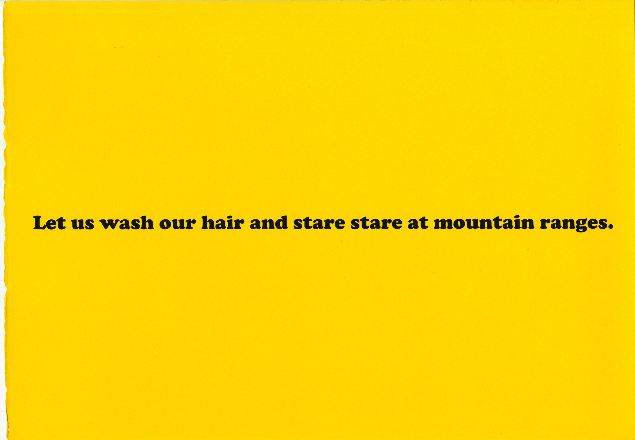
(Screenprint, 3/30, 2020)
Featuring the words of Gertrude Stein, this design was originally part of the Manifest Destiny Billboard Project, a series of works arranged by the Los Angeles Nomadic Division that were displayed along highways in the USA and visible to all drivers heading westward. Eve Fowler designed ten billboards for the project which were erected along the I10 in Texas, as well as establishing a selection of lending libraries on the route stocked with queer literature. The words are from Stein’s 1989 work Lifting Belly, a book of erotic poetry written from Stein to Alice Toklas. Fowler loved the idea of a queer romantic exchange displayed next to religious billboards, and of people identifying with the quote, then later finding out it was queer.
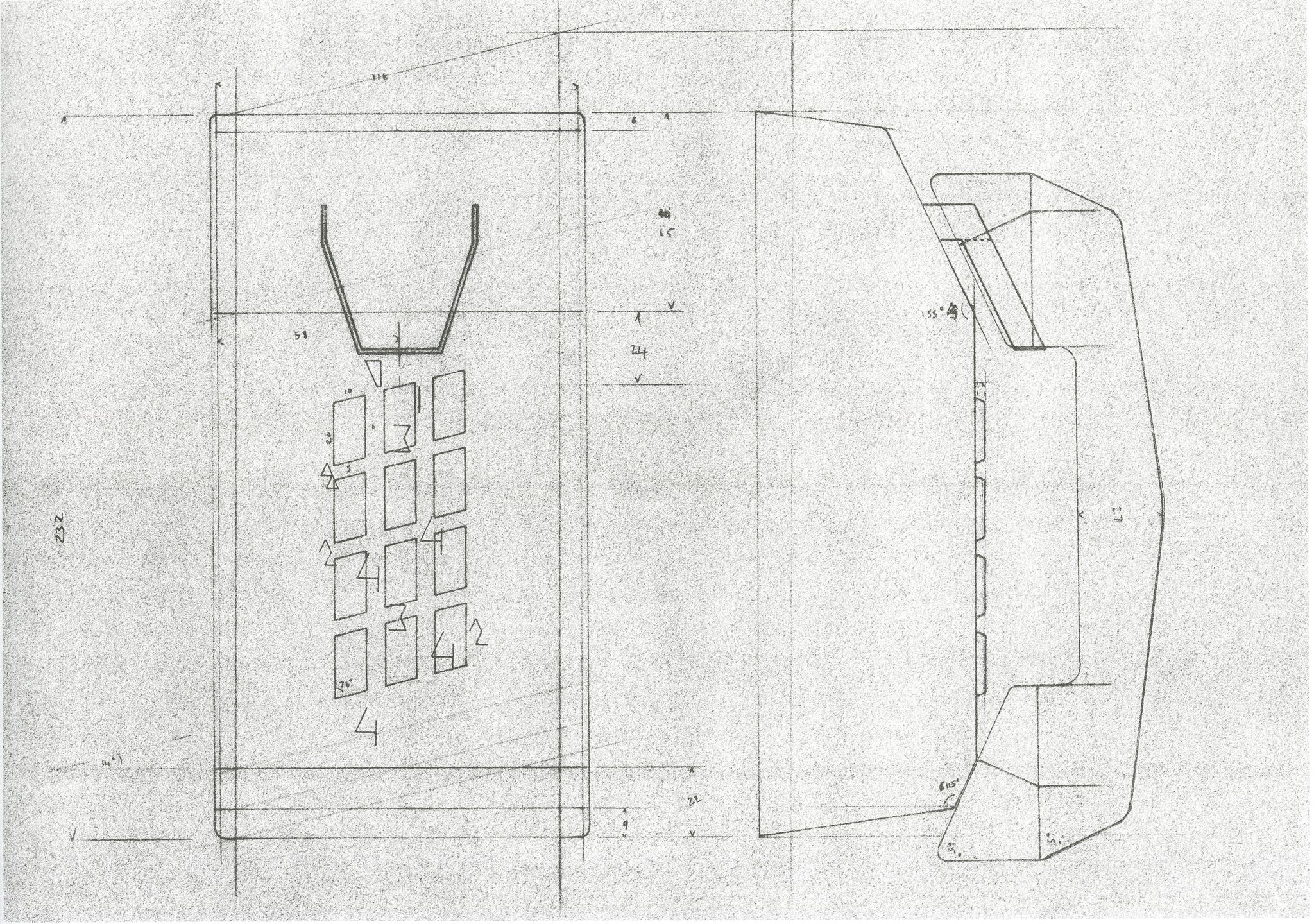
(Screenprint, 3/30, 2020)
This image started as a development drawing for a set of sculptural painted phones that Boyce created for an exhibition at the Galerie Eva Presenhuber in Zurich. He was inspired by an image of an old wall mounted phone and the idea that, in the age before the modern mobile phone, these devices served as technological portals between fixed points in space and time. For the DCA print Boyce overlaid DCA’s phone number on to the print, deliberately misaligning the numbers from the buttons to conjure the image of memory and the movement of fingers over the buttons.

(Screenprint, 3/30, 2020)
Riffing on the image of classic 1970s theatrical playbills, this two-colour poster was created for the collection as a companion to Staff’s exhibition The Prince of Homburg, which took place at the DCA between June and September 2019. The piece also draws visual clues from archival movie posters as well as the design sensibilities of leftist design cooperatives such as the Detroit Printing Co-op, a leftist press that operated between 1969-1980, and whose publications included the journal Radical America as well as books like The Political Thought of James Forman printed by the League of Revolutionary Black Workers.
(Digital print and screenprint, 3/30, 2020)
Taken on Gapado Island, a small island off the southwestern coast of South Korea, this image was captured as part of an artist residency programme intended to help preserve the unique cultural and environmental heritage of Gapado. The island is home to an elderly generation who maintain their traditions of Shamanism and shrine worship, practices that date back to pre-history but that have been in sharp decline over the last century. Gapado also hosts the Haenyeo free divers, an all-female group who make their livelihood from catching sea-life and other marine paraphernalia up to 50ft below the waves.
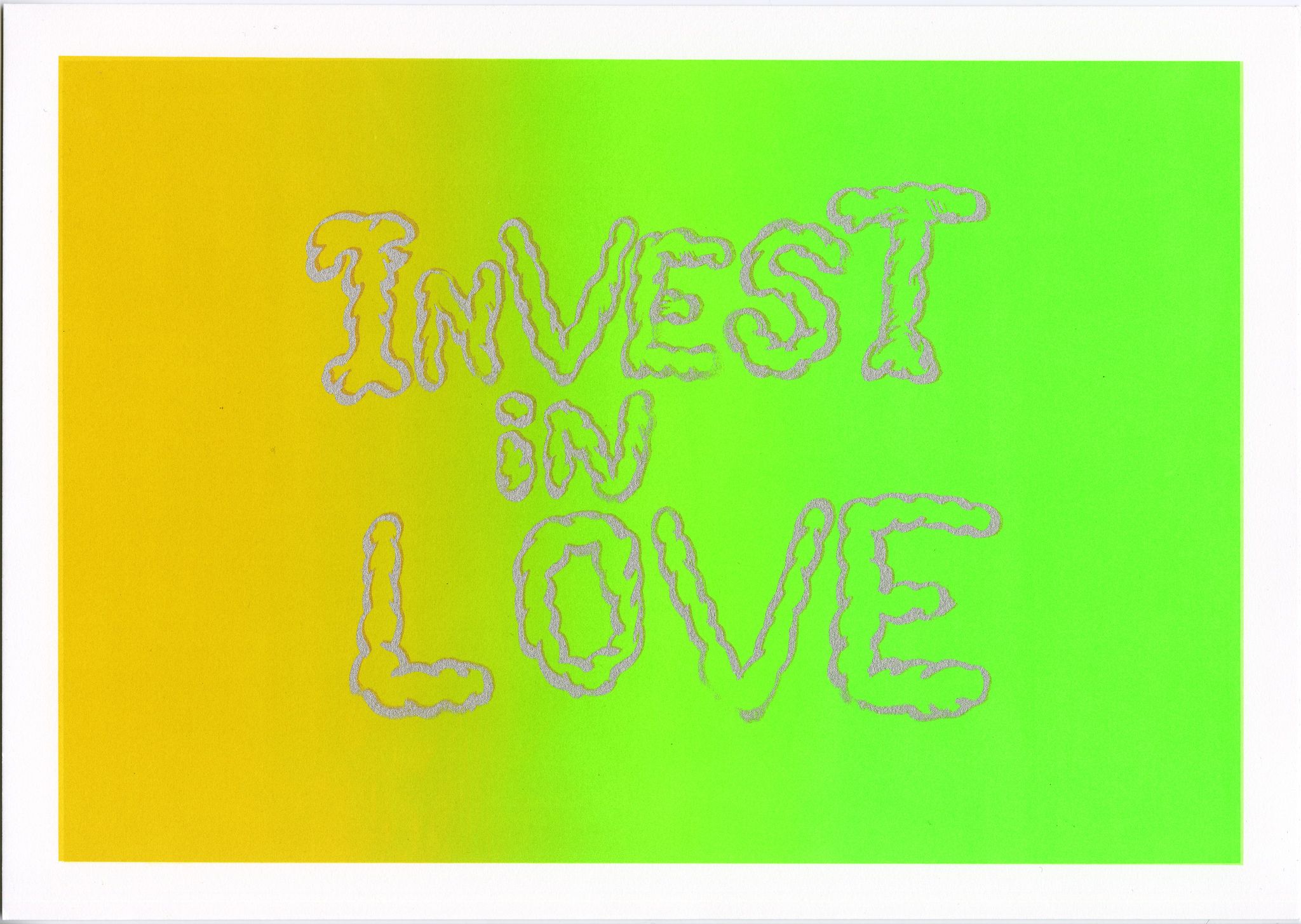
(Screenprint with copper and silver powder lettering, 3/30, 2020)
Whittle composed Invest in Love to speak to her “research on self-compassion and mutual care as forms of resistance to the catastrophe of the hostile environment”. The imperfect shapes of the lettering is designed to mimic finger writing on condensation. They serve as a reminder that the care we show to ourselves and those around us is often temporary, and an urging to bring that love into the everyday – both love for the self as well as love for others.
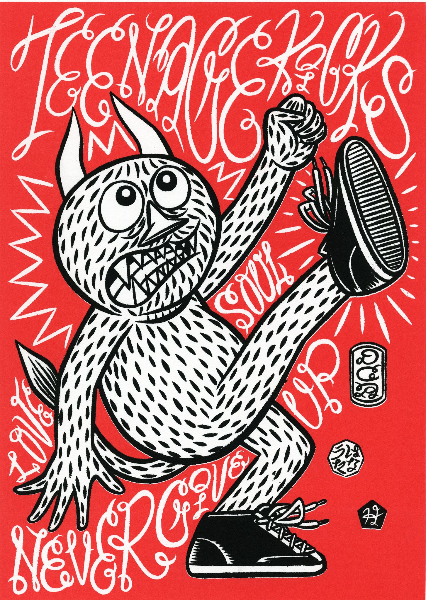
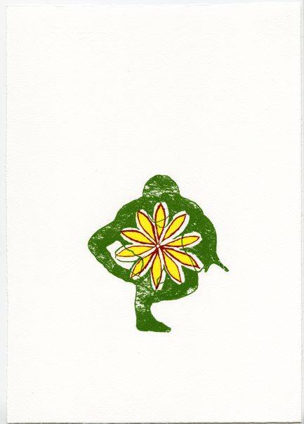
Teenage Kicks takes its name from the 70’s punk rock hit of the same name. Hanayuta, the rebellious creature at the centre of the work, has appeared in several of Katasuma’s works over the years, even getting his own action figures in 2015 in conjunction with the Uso de Hontou solo exhibition at the DCA. The artist designed the work to radiate positivity, showing a never give up attitude and facing the Covid-19 pandemic with love and soul. The shade of red that permeates the piece is named Hideyuki DCA Red and was central to the mural at the centre of the 2015 exhibition, emphasising the artworks connection to the DCA.
By Christine Borland
(Screenprint, 3/30, 2020)
This print is the first part of a new series of works from the artist that seek to explore the cultural memory and knowledge of flax cultivation in Scotland. Flax was commonly grown in Scotland for a long period, being particularly widespread from approximately the 1720s to the 1820s, and was primarily used to create linen for garments and household items. Despite state support, and a short-lived revival during the Second World War, Scottish flax was ultimately out competed by international markets and both flax farming and linen weaving are now almost extinct in the country. The little flax farming that remains is used in the production of linseed oil.
___________________________________________________________________________________
The University of Stirling Art Collection purchased this portfolio of prints from Dundee Contemporary Arts during lockdown. The purchase was generously fully funded by the National Fund for Acquisitions. The prints are being displayed together as part of the year’s theme, which is health and wellbeing, under the title ‘The Art of Wellbeing’. The portfolio was created to mark an extraordinary, challenging year, and to support DCA’s recovery from a crisis that has gripped the entire cultural sector. The remarkable diversity of the finished works eloquently reflects the range of the DCA programme, and the possibilities of working with its Print Studio.