In this week’s blog, Art Collection Intern Marthe Huser-Daehlie has selected some works from the Collection to give her personal view of spring in art.
Spring has now had a few good weeks to acclimatise and has cemented its presence into our day-to-day activities. No longer do we solely rely on the need for rain proof clothing even if it’s just through hope. It’s a time for rebirth and reflection on what is to come as the weather gets cosier and warmer. Within art, spring has always gifted us with landscapes of wildflowers, pastures of animals, and glorious colours. There are paintings, sketches, etchings, and engravings that focus entirely on light and bold colours alone. We have been gifted with illuminated faces covered with that famous spring glow in numerous portraits and the ray of light has something a little extra.
Scottish spring has its own identity, it is different to the rest of the UK. There are longer days, less rainfall. Scotland’s true beauty starts to come alive again after a suppressive winter. To imagine what Scottish artists especially contemporary artists would have gravitated towards to incorporate into their paintings I have selected a few from The Collection.

(Oil on canvas)
There is nothing better than to walk outside and to see the trees start to blossom around you, just make sure to take your hay fever tablets before! I grew up in the southern hemisphere where every spring the jacaranda trees would bloom signalling the start of the warm weather. That nostalgic feeling is what I see when I look at the works by Richard Robbins.
Robbins, an accomplished artist whose paintings adorn many homes in Britain, was a remarkable artist with a keen eye for nature, in particular florals. Educated at Oxford and the Slade School of Art, Robbins’ painting style is very much part of the contemporary movement. This painting as with his other creations demonstrates his understanding of the relationship between paint and paintbrush – take a close look and try and see the brushstrokes up close. This painting is wonderfully arranged with bright colours of blues and pinks. The flowering tree blossoms are so evident with the dark background. One of the main reasons I chose this painting was due to its colourful canvas, I felt it really showcases spring and the act of rebirth. The blossom bulbs are so bright and captivating, which really allows your mind to venture to how it would look fully bloomed. If you like Richard Robbins’ paintings go online and search – there are a wonderful collection out there.
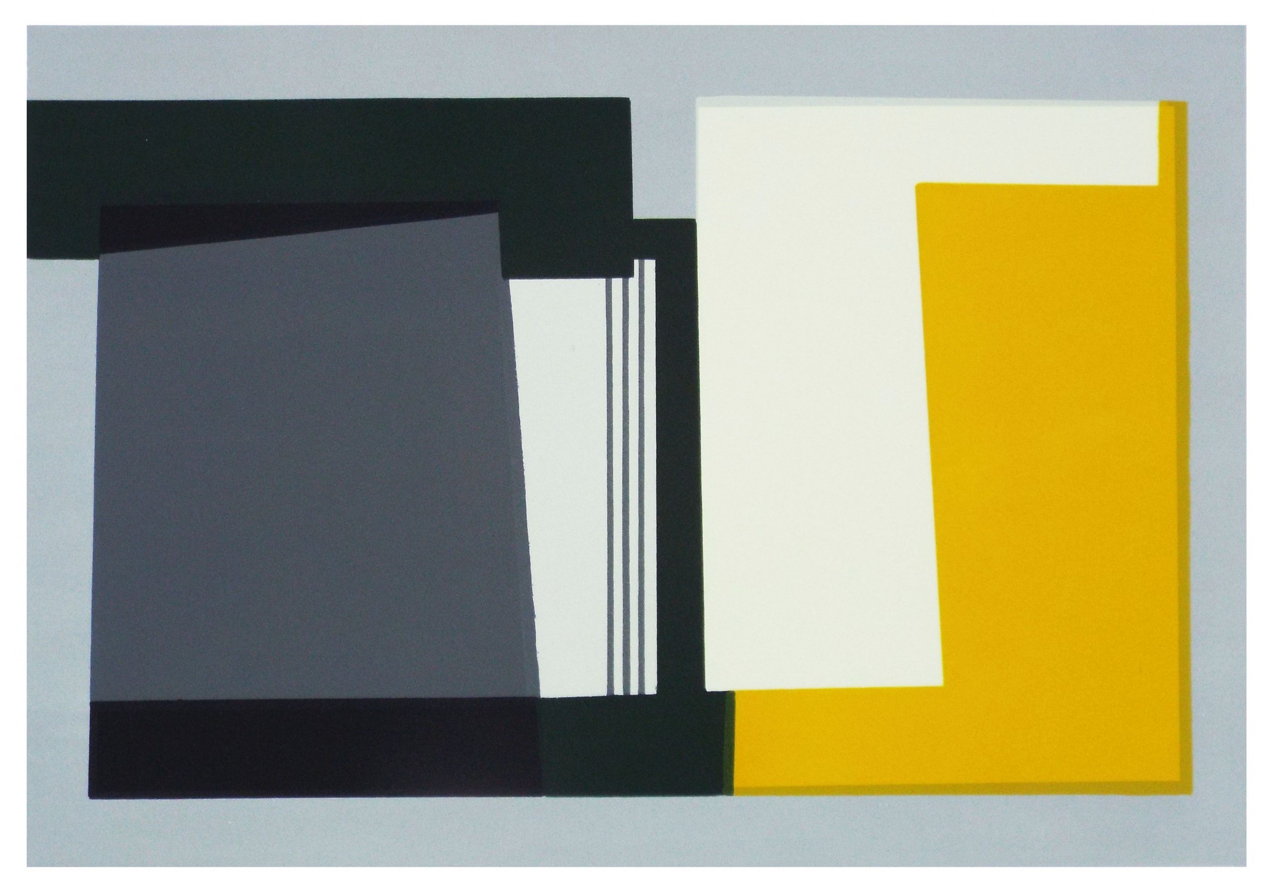
Screenprint 7/25 2018
I chose this print based entirely on the fact that I have never seen a depiction of a landscape as geometrical as this. With inspiration taken from Aberdeenshire, many of the landscapes created by Hetty Haxworth showcase an advanced partnership between colour and geometric shapes and the placement of them. In this print, the artist has created a work that takes and emphasises the progression and the relationship it has with light as it changes over the seasons. The bond of time and the progression it has is often showcased in her works and is a large part of the main centric theme. There is a varied collection of lines and symmetric compositions within this work and as mentioned, this is to show the progression of the light as the seasons change. Spring is such a wonderful time of year and this print showcases the literal understanding of how light shifts between the seasons. There is also an inclusion of man-made-structures which is depicted through the use of the geometric lines and framing.
(Lithograph, 1996)
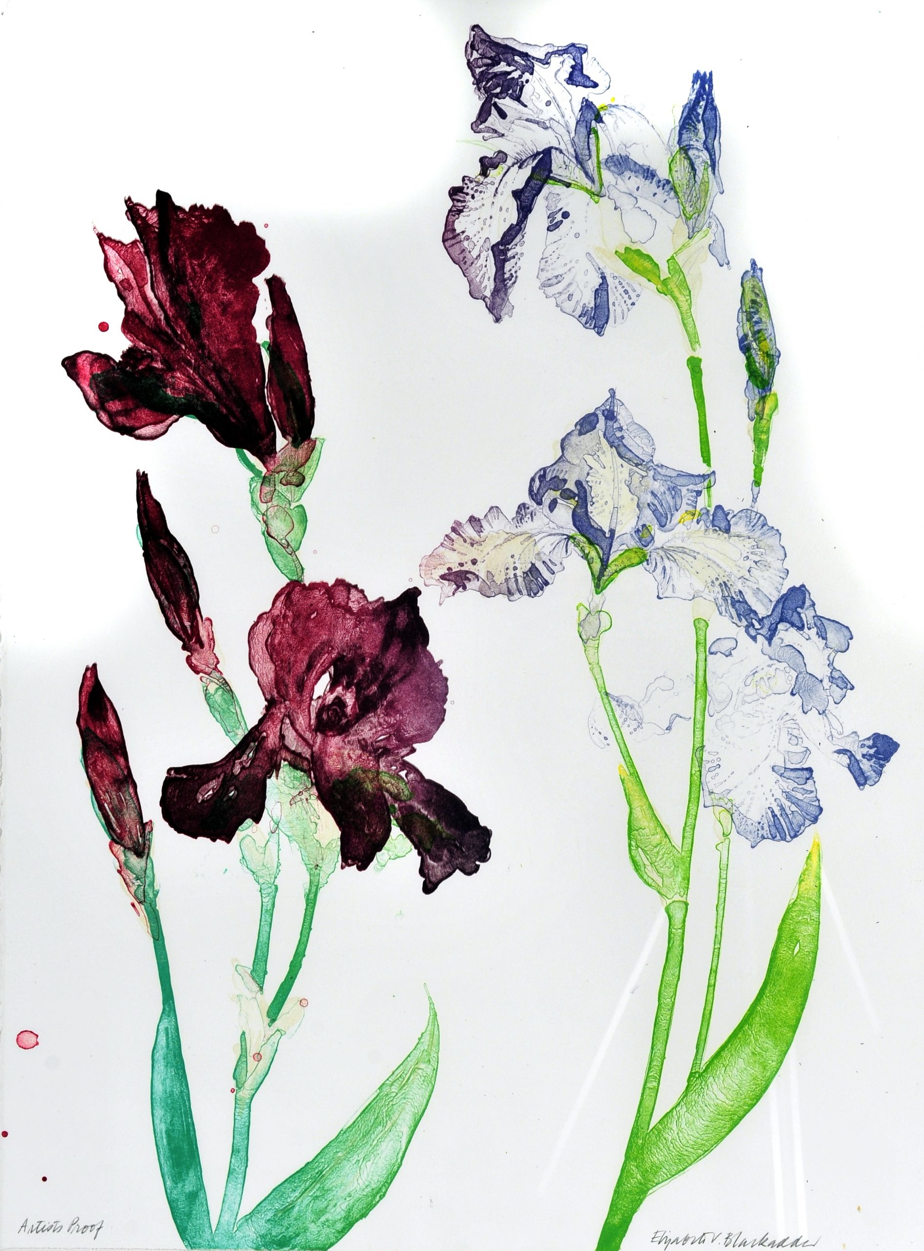
Spring is truly a season of rebirth and prosperity especially in our gardens regardless of size. Sprouts of colour can be found in our trees or garden beds. Dame Elizabeth Blackadder is a woman of magnificent talents, especially for the botany and the texture that grows within nature.
There is nothing better than a floral work. This print by Blackadder is beautiful and, in my opinion, a great example of spring and what is to come. Now more than ever the need to have something to look forward to is so important. This print is a depiction of irises which are a staple within the gardens of Britain. There is a level between normality and exoticism within this print. The dark and exotic deep purple stands out rustically next to the lightly blue kissed iris to the right. Blackadder was an avid fan of garden culture especially upon the collection of the variety of flowers one could find there. This print is a great example of how Blackadder’s passion for botany is showcased. The petals of the irises are so realistic, and the different pigmentations shows the depth of the different colours petals have.
If you’re up to the challenge maybe go out and explore the fields or gardens near you and sketch some flowers. Inspect the petals and the intricate bond the colours blend into each other.
(Oil and wax on board, 2005)
‘I prefer to leave the interpretation of my paintings up to the individual, hoping to evoke a sense of calm through my work and to offer an escape to the viewer – a chance to reflect and gain a new perspective on life.’
– Alison McGill
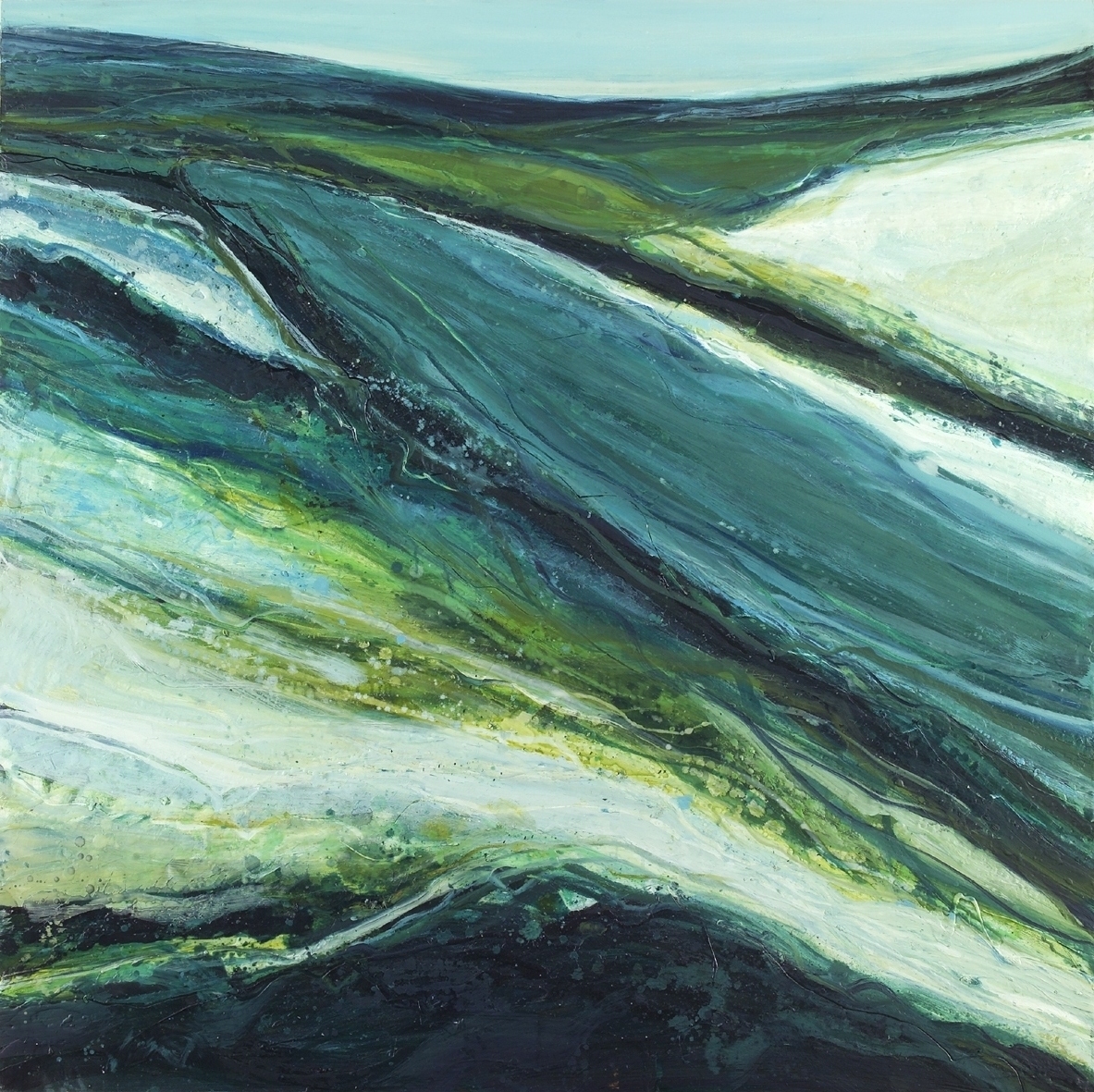
An award-winning artist whose main aim is to create paintings to evoke individual emotions, Alison McGill has a pure talent inspired by her homeland of Scotland. With the running theme of Spring, this painting has such a strong ability to be anything. This painting in particular showcases the moulding of the landscape and the depth of how the colours work together to deliver the dimensions. When I first saw this painting, I almost instinctively thought it was the sea, the different blues, and tinges of yellow almost creates this separation that waves create when colliding to each other. But it’s not the sea, it’s a landscape that depicts rolling hills. There is something nostalgic and rural about the painting, inspiration taken from America, and yet my mind only goes to the rustic hills found in Scotland. It’s a beautiful work and I invite you to find more of Alison’s work to see the depth of colour exploration. As she herself says, it is for us to find a meaning behind it. It’s open to anyone.
(Oil on canvas, 2006)
When I looked at this painting by May Chipulina, an instinct that I can’t place made me crack open google and start a search for more, for if there was a Spring, there might be more of the seasons right? Yes, there were.
It’s no secret to my friends that contemporary paintings aren’t on the top of my list, but this range of work is minimalistic yet so informative – something that I personally find the best quality of art. I look at art to tell me a story, I have learnt patience and I have found a little spark of love for contemporary paintings since I began my internship here at The Art Collection, Stirling University.
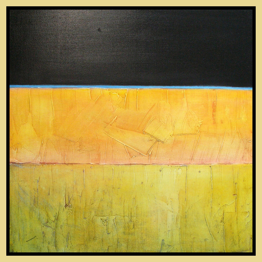
This painting is part of a series of four, Spring, Summer, Autumn and Winter, all depicting a scene that changes based on the seasons. Through a bit more research I found that Chipulina uses a method made famous in the renaissance time – gesso. This technique allows for texture and depth to be created before the paint is painted in layers on top. The scene depicts three sections, a field of grass illuminated by the golden sky above which is then framed by the atmosphere. The texture is so immersive it is hard to not imagine grass straws and golden rays of the sun.