In this post, project archivist Jenny Duffy takes a look at over a century of magazine covers from the archive of the Aberlour Child Care Trust
Is there anything more indicative of how an organisation sees itself and how it wants to be seen by the outside world than its magazine? The historical publications of The Aberlour Orphanage are no exception and the covers alone illustrate the journey of this charitable organisation from a few years after its foundation in 1874, in a small Morayshire village, to its provision of Scotland wide residential childcare over a century later.
Beginnings
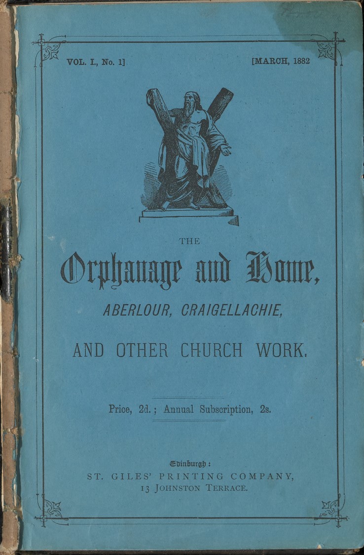
The very first edition of The Aberlour Orphanage magazine was published in March 1882 after the warden and founder, Canon Charles Jupp, proposed at the AGM that he “thought it would be advisable to issue a monthly journal in connection with the institution, to be circulated among the subscribers” . The Orphanage’s religious foundations are displayed prominently on the inaugural cover, the colour of which would lead to the magazine being referred to as The Blue Book for many years to come.
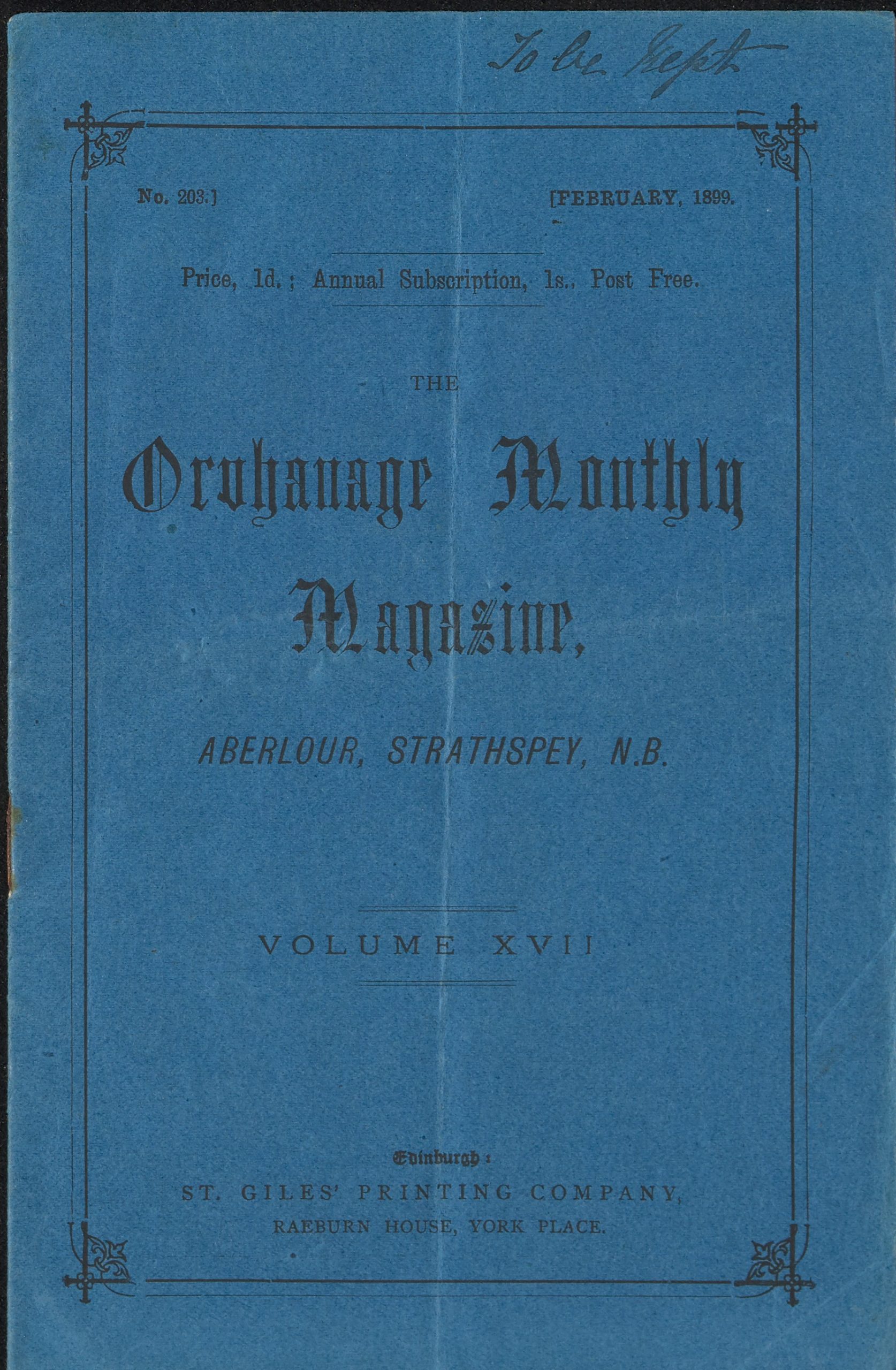
By the turn of the 20th century the magazine’s cover had been simplified to show the Orphanage’s name only; the inclusion of N.B [North Britain], instead of Craigellachie as seen in earlier editions, as the orphanage’s location, perhaps shows its desire at this time to be seen as a British organisation rather than solely Scottish.
Certainly the Orphanage regularly admitted children from south of the border but its Scottish identity would come much more to the fore in the magazines as time went on.
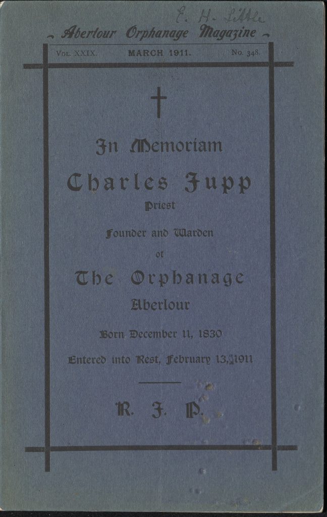
The magazine cover continued with a simple style into the early 20th century, occasionally straying from the traditional blue cover adopted in its infancy.
A special cover was printed for a memorial edition following the death of the Orphanage’s founder Canon Jupp in 1911. By now the location of the Orphanage is cited as Scotland, beginning the promotion of its Scottish identity.
The Child’s Appeal
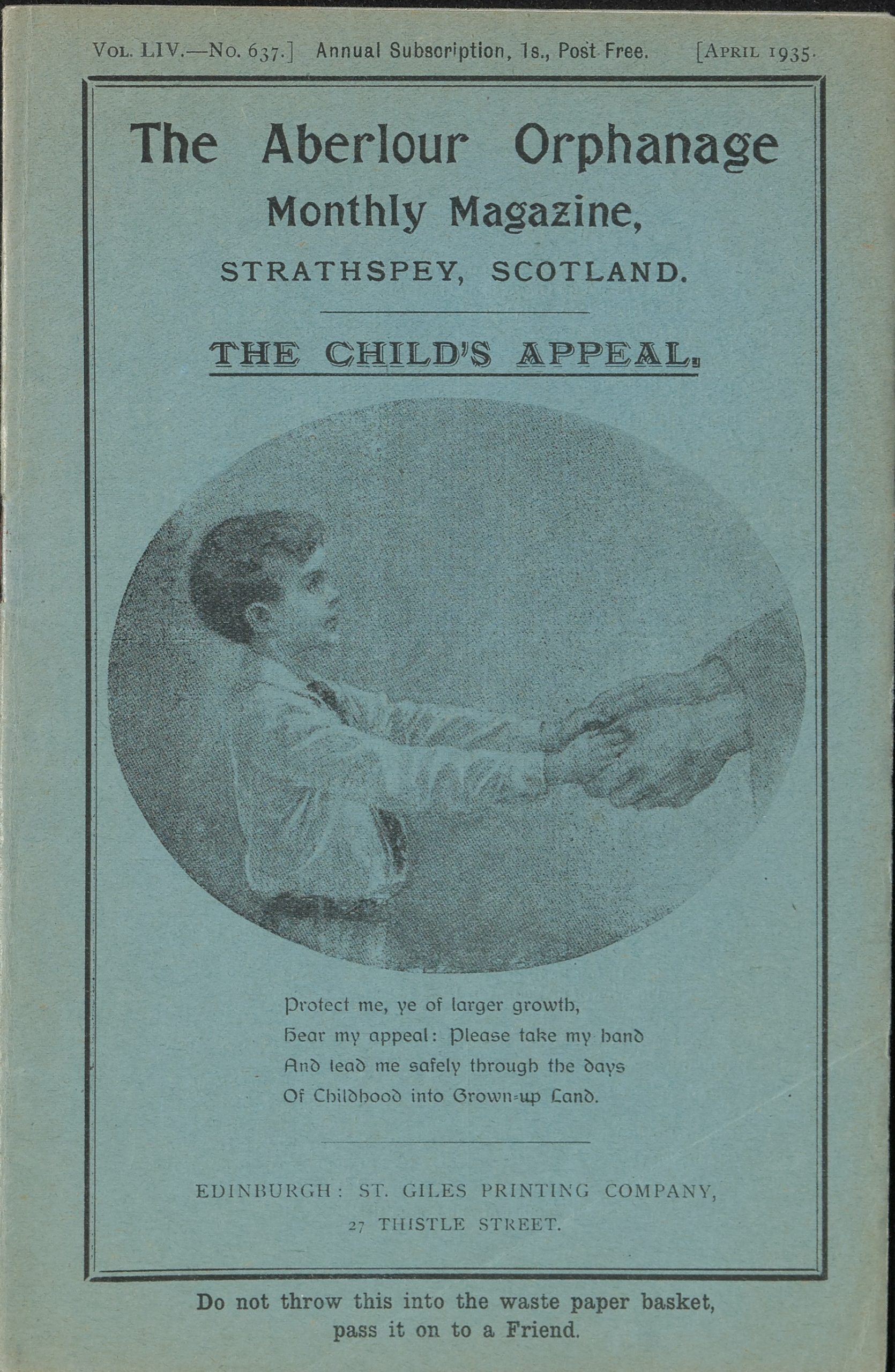
The mid-1930s saw the appearance of the cover that would remain in place, unchanged, for the next 30 years. It shows an illustration of an orphan child accompanied by a poem “The Childs Appeal” – a direct plea to subscribers from the orphanage children themselves.
The children were not altogether happy with this portrayal however, as Dorothy Haynes writes of the magazine in her memoir, Haste Ye Back:
“The monthly magazine was a blue-covered booklet with a panoramic drawing of the orphanage on the back cover, and on the front the picture of a child holding a man’s hand, looking up at him soulfully, and saying “Protect me, ye of larger growth. Hear my appeal. Please take my hand And lead me safely through these days of childhood into grown-up land”. It was a verse we did not entirely relish.”
A Change of Direction
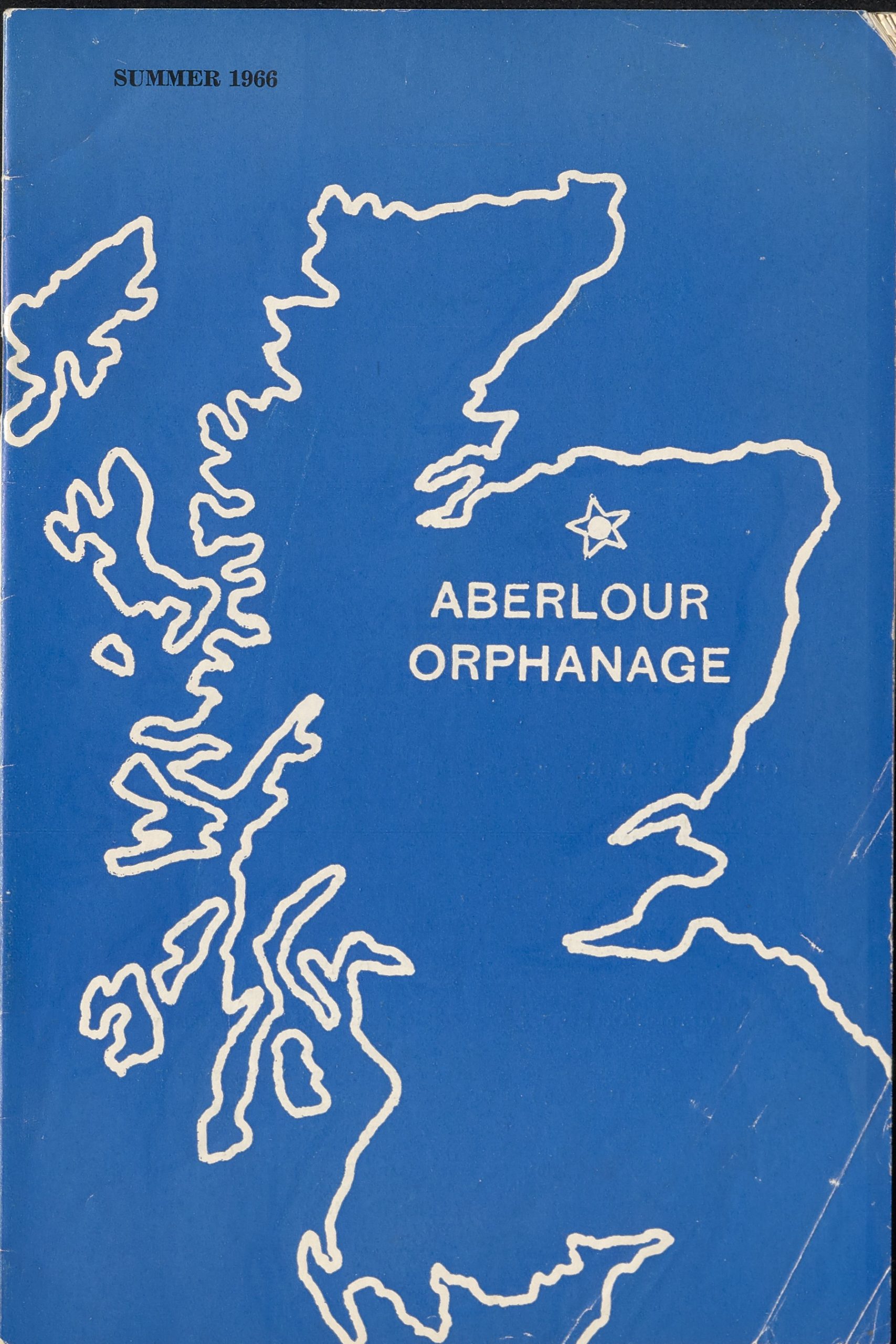
To save on both production and postage costs, it was proposed in 1940 that the magazine should be issued every two months instead of monthly but in appearance it remained unchanged until 1960 when a more modern and less religious cover was introduced. The traditional blue colour was retained, albeit a bit brighter, but this was the only nod to previous incarnations; the image of the poor orphan child and his appeal was replaced with a simple outline of Scotland and a star to mark the Orphanage’s location. The governing body was keen to include some form of national advertising on the back cover as long as this was of a non-commercial nature such as an insurance company but as no suitable advertiser had been found by August of that year, the matter was laid to rest.
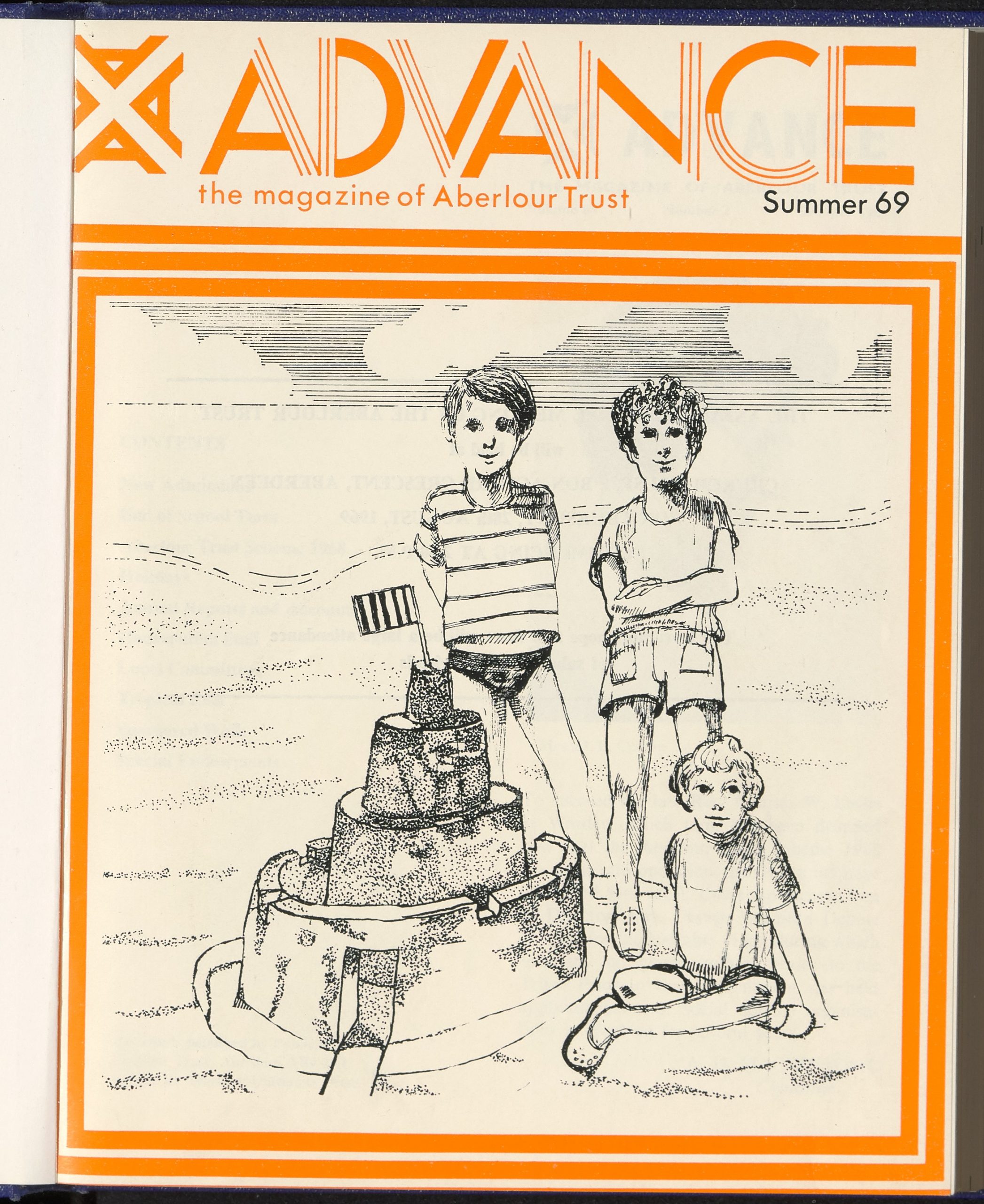
The Four A’s

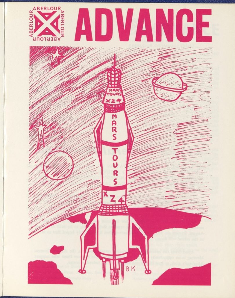
It seems, however, that this new, simple, and modern cover design did not break with tradition quite enough as it was replaced less than ten years later when, in 1967, the magazine underwent its most dramatic change to date. By the mid-1960s the process of closing the orphanage and replacing it with a number of small group homes across the country was well under way. The organisation had completely changed its operational model and the new magazine aimed to reflect that.
The size was changed, more colour was used and the magazine was given the new name of Advance. A new logo was designed incorporating four A’s referring to Aberlour, Advancing, Aid, and Adventuring. An explanation of the logo in the Spring 1968 edition of Advance reveals that the arrangement is also significant:
“The four A’s make the saltire, the cross of St. Andrew, showing at once that Aberlour is a specifically Christian foundation and a specifically Scottish foundation. It is founded in Scotland to serve first the children of Scotland. I has no connections with any organisation outwith Scotland. It looks to Scotland and friends of Scotland for aid and support, and this aid and support is all used in Scotland.”
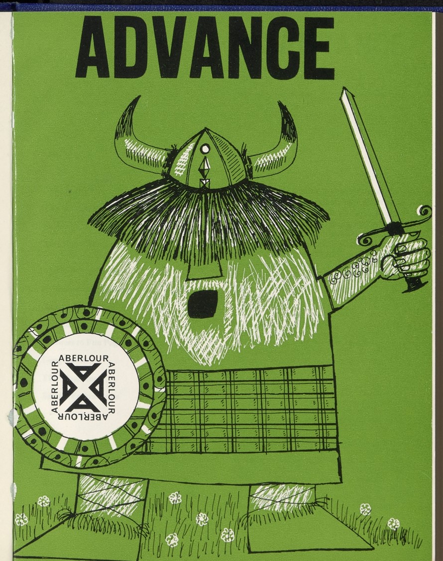
The covers of Advance, while at times exhibiting a recognisable style, are an eclectic collection of line drawings and prints including one of a space rocket designed by a child in care; this inclusion of content by and for the children in the Trust’s care was a dramatic change of direction for the magazine. It was agreed at a management meeting in 1973 that “the magazine could perhaps be made more interesting if reference was made to the children as this was what subscribers wanted”.
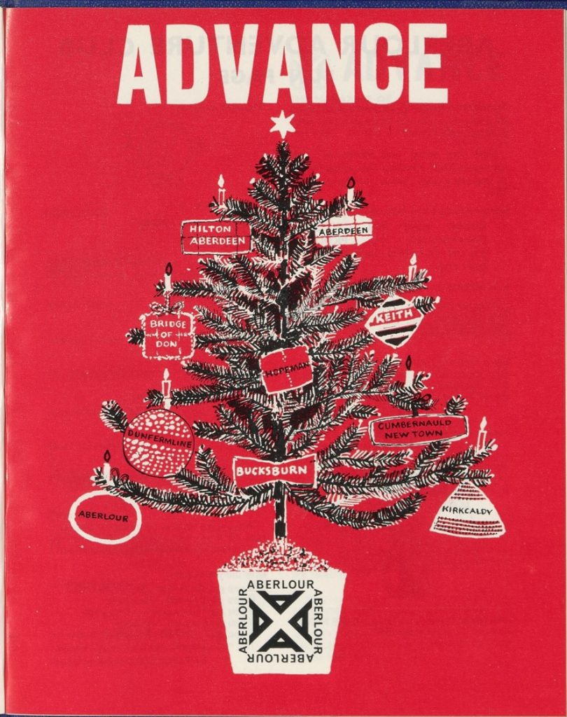
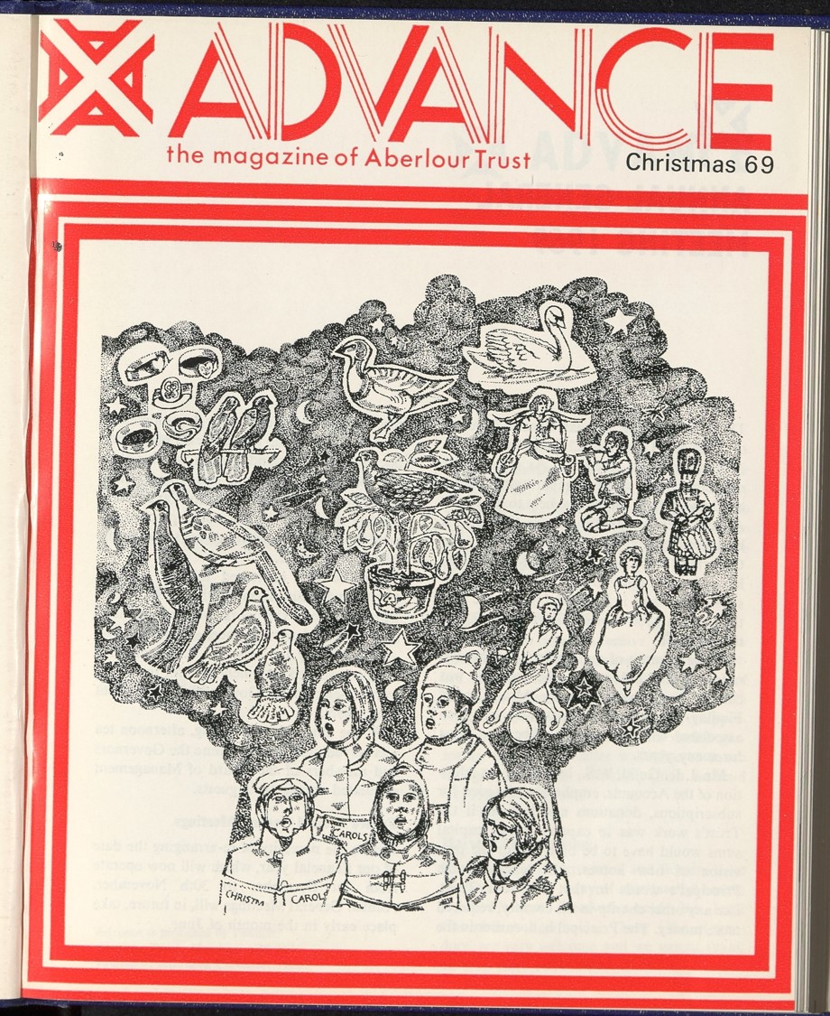
The new logo was simplified a few years later with the surrounding text “Aberlour” removed to leave the four A’s only, but the covers continue with more colour and an increased emphasis on children:
A New Outlook
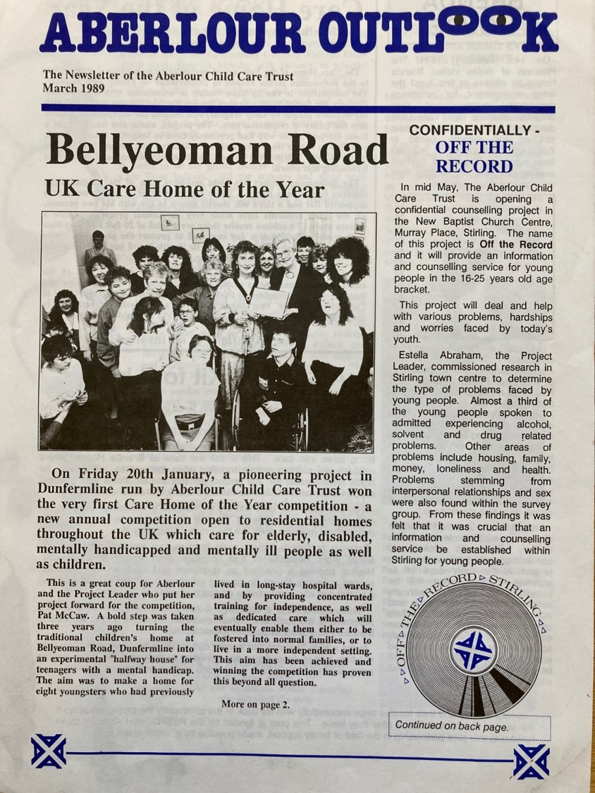
However, the writing was already on the wall for the magazine; only a year earlier the chairman had wondered if, instead of publishing a magazine, whether it would be better, or serve a more useful purpose, to send out a newsletter to subscribers periodically, as this may prove to be a “little more friendly and less expensive to produce”. And indeed production of Advance appears to cease in the late 1970s to be replaced the following decade with Aberlour Outlook, a four page newsletter, more informal in nature but retaining the four A’s logo and, of course, the colour blue.
The archive of the Aberlour Child Care Trust is currently being analysed as part of “Back to the Future: Archiving Residential Children’s Homes (ARCH)”, a project being undertaken by the Faculty of Social Science.
An Archives Revealed Award has also been secured to enable the entire collection to be catalogued and rehoused by the University Archives.