(Aquatint, 2001)
In the newly installed exhibition in the Crush Hall, entitled Blue, on display are works from the permanent collection which include this colour. Here, we consider some of the art in more depth.
(Oil on canvas, 1974)
Pigments which produce blue have throughout the ages been highly prized: cobalt, ground down into smalt, was used for the deep cathedral blue of medieval stained glass, as seen in this painting by Sir Robin Philipson, which was gifted to the University by the artist following the sudden untimely death of the first Principal Tom Cottrell, and originally hung in the Chaplaincy on campus. Philipson was well-known for his bold use of colour. His work during the 1960s included a series of Gothic cathedral interiors, inspired by summer visits to France, a subject choice made particularly poignant by the knowledge that his first wife, with whom he shared these holidays, had died of cancer in 1960. The blue in Chartres Cathedral is the most famous – known as ‘Chartres-blue’ – and apparently contained a small amount of red. The thickness of the glass used at that time adds to the intensity of colour.
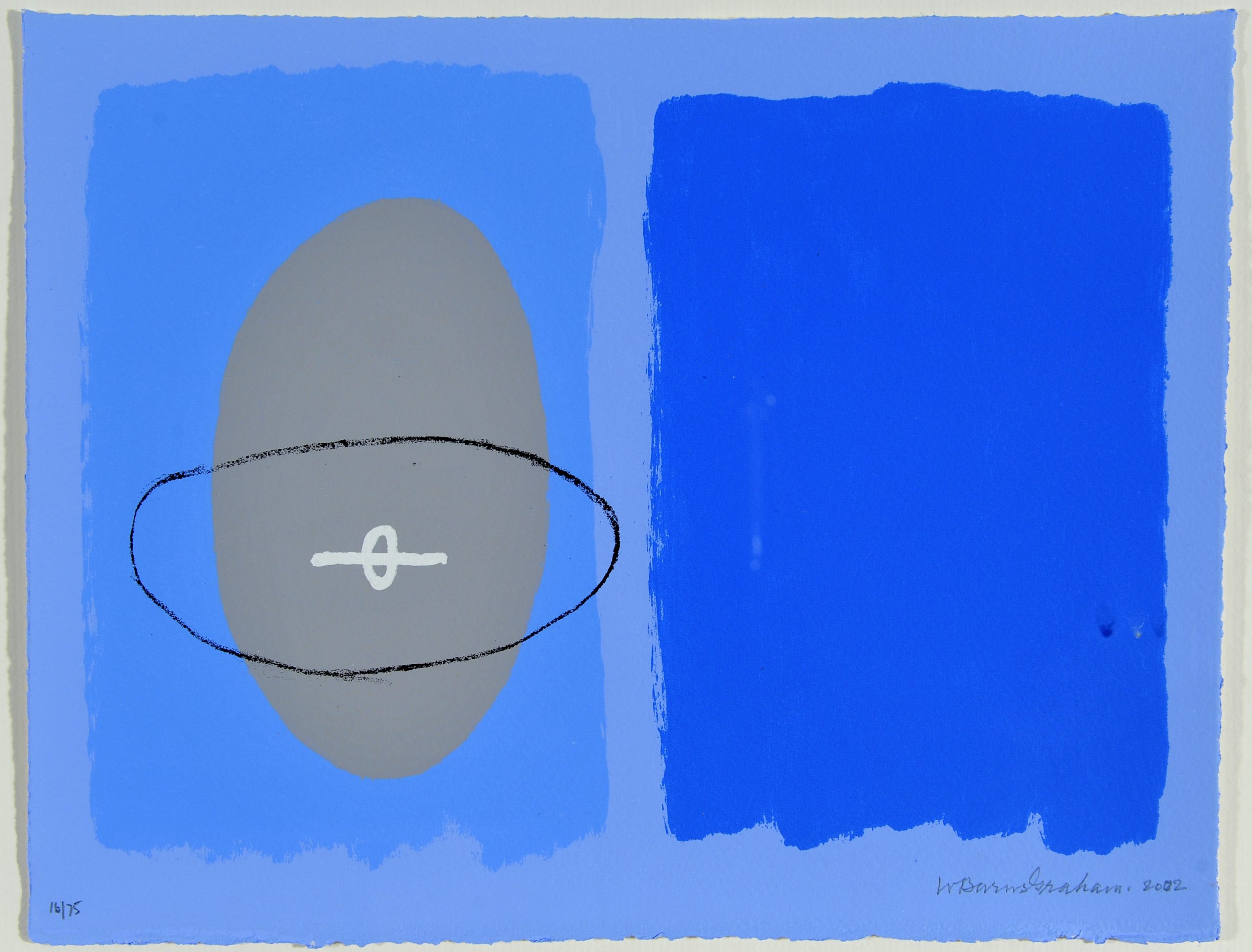
(Screenprint, 2001)
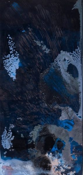
This work is similarly created as a remembrance: Wilhelmina Barns-Graham here pays homage to her friend and fellow St Ives artist John Wells, who died in July 2000. The egg shape that features was a prominent feature of Wells’ early experiments with abstract art. This shape seemed to attract Wells and others in the St Ives Group (including Barbara Hepworth), as it was both organic and abstract. The strength of the shades of blue used here strongly evoke the Cornish sea and sky.
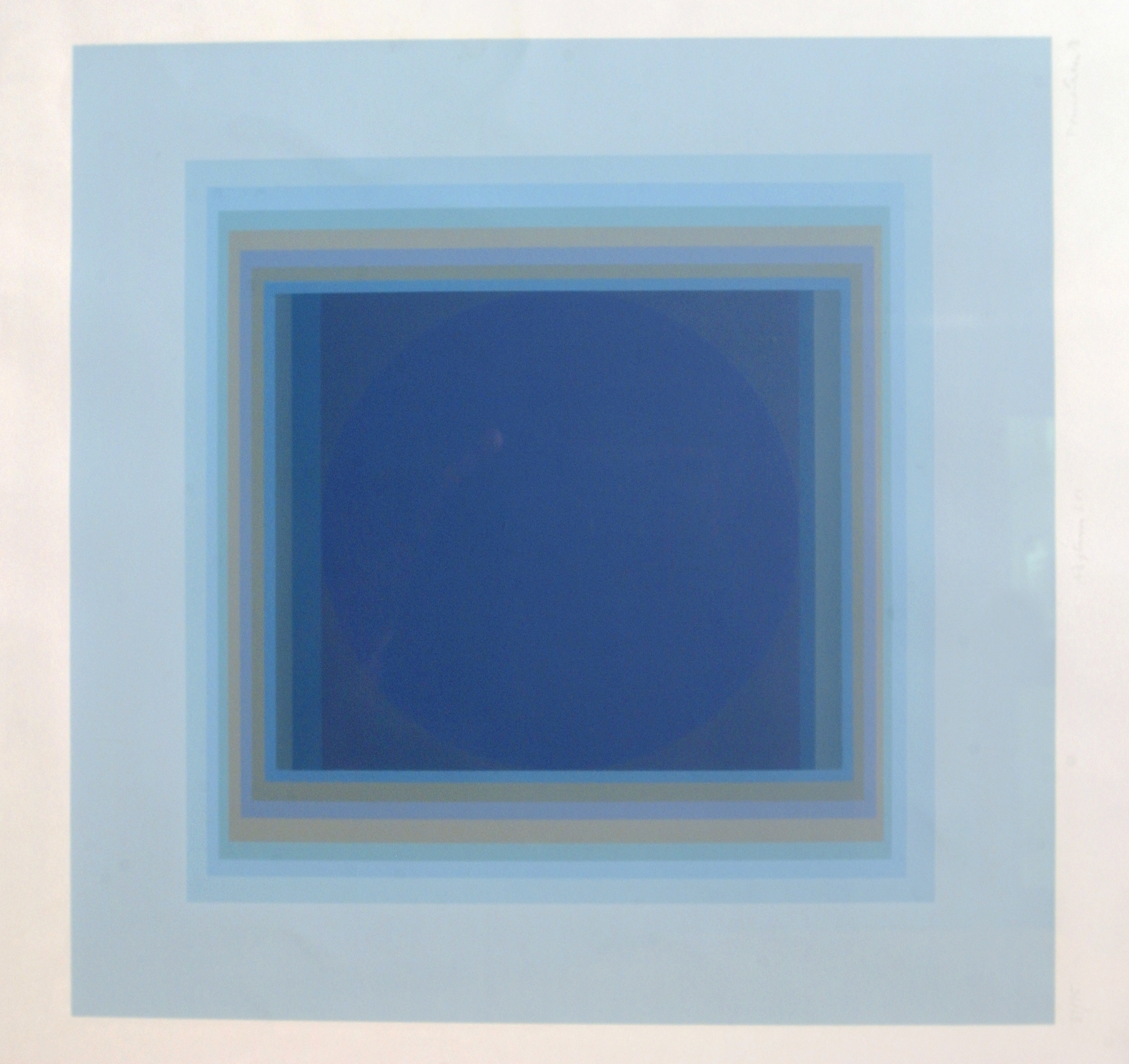
(Screenprint)
At first glance a completely abstract piece, this work by Paul Feiler is in fact inspired by looking skyward: when a science writer showed him a girder he had picked up on the Apollo 11 launch site, and asked him to paint the Moon, Feiler created square paintings in which perpendicular and rectangular matrices frame often circular, sometimes square or striped inner spaces. This print came out of the Adytum/Aduton series of paintings of 1969. If you look closely you can see the ‘moon’, in deepest blue, framed inside the central square. Feiler’s works have an elegant geometric patterned style, with a refined and spiritual quality. Like Barns-Graham (above) he also found his main source of inspiration in Cornwall which he first visited in 1949, and where he became associated with the St Ives community.
(Household paint, double-glazing unit, steel frame, 2016)
Another abstract work suggestive of the night sky is this one by Kevin Harman. The artist creates these works by filling discarded double-glazing units with found household paints. In making these objects of unexpected beauty, Harman also challenges the understood purpose of his found materials. The window unit, originally designed and manufactured as something to look through, becomes an object to be looked at.
The blues and greys of this work are reminiscent of an atmospheric stormy night sky, which contrasts well with James Morrison‘s distinctive huge sky paintings (one of which is shown below). These are usually filled with majestically-shaped, broad-brush clouds, and convey the wide spaciousness of the Scottish landscape in Morrison’s particularly distinctive and unmistakable style. Although detailed, these works were often painted quite quickly outdoors, on large boards.
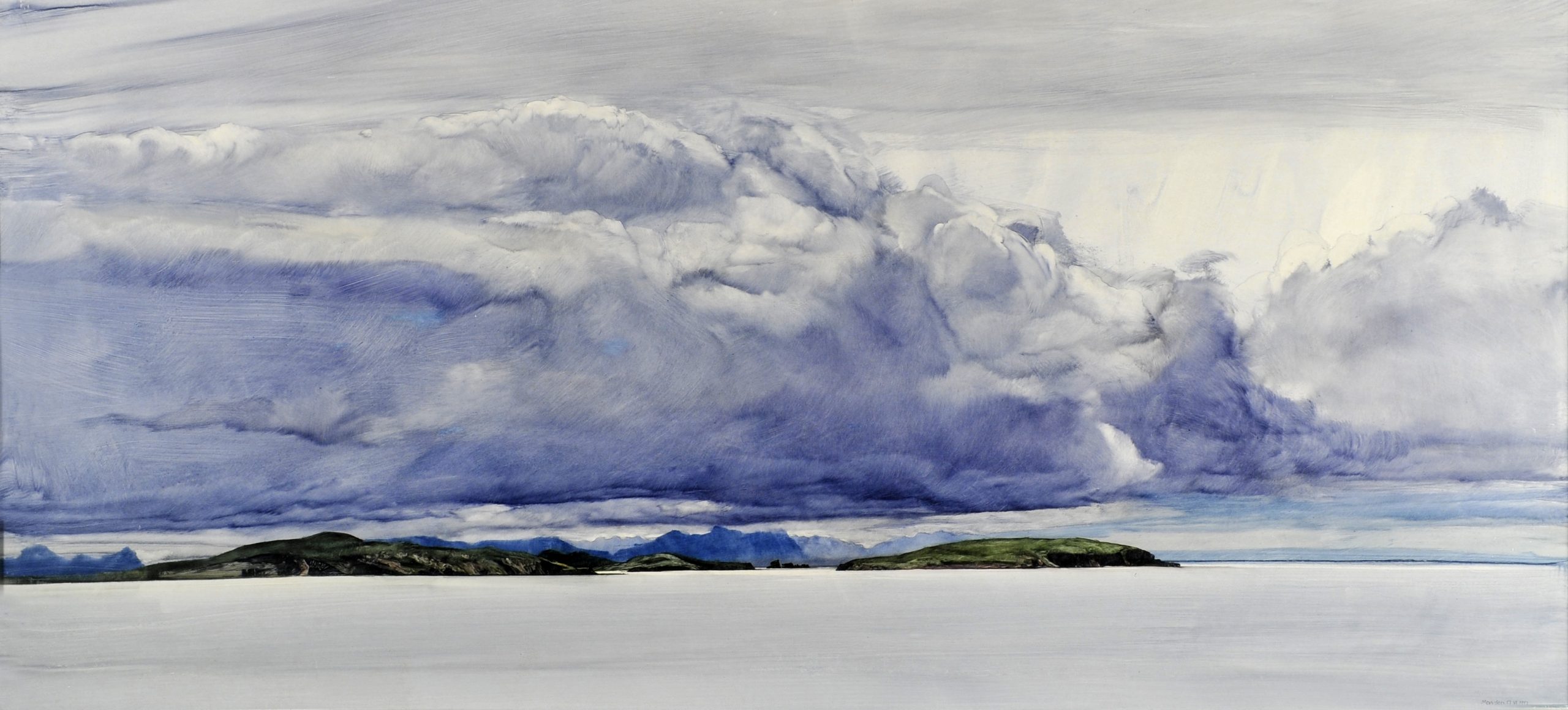
(Oil on board, 1997)
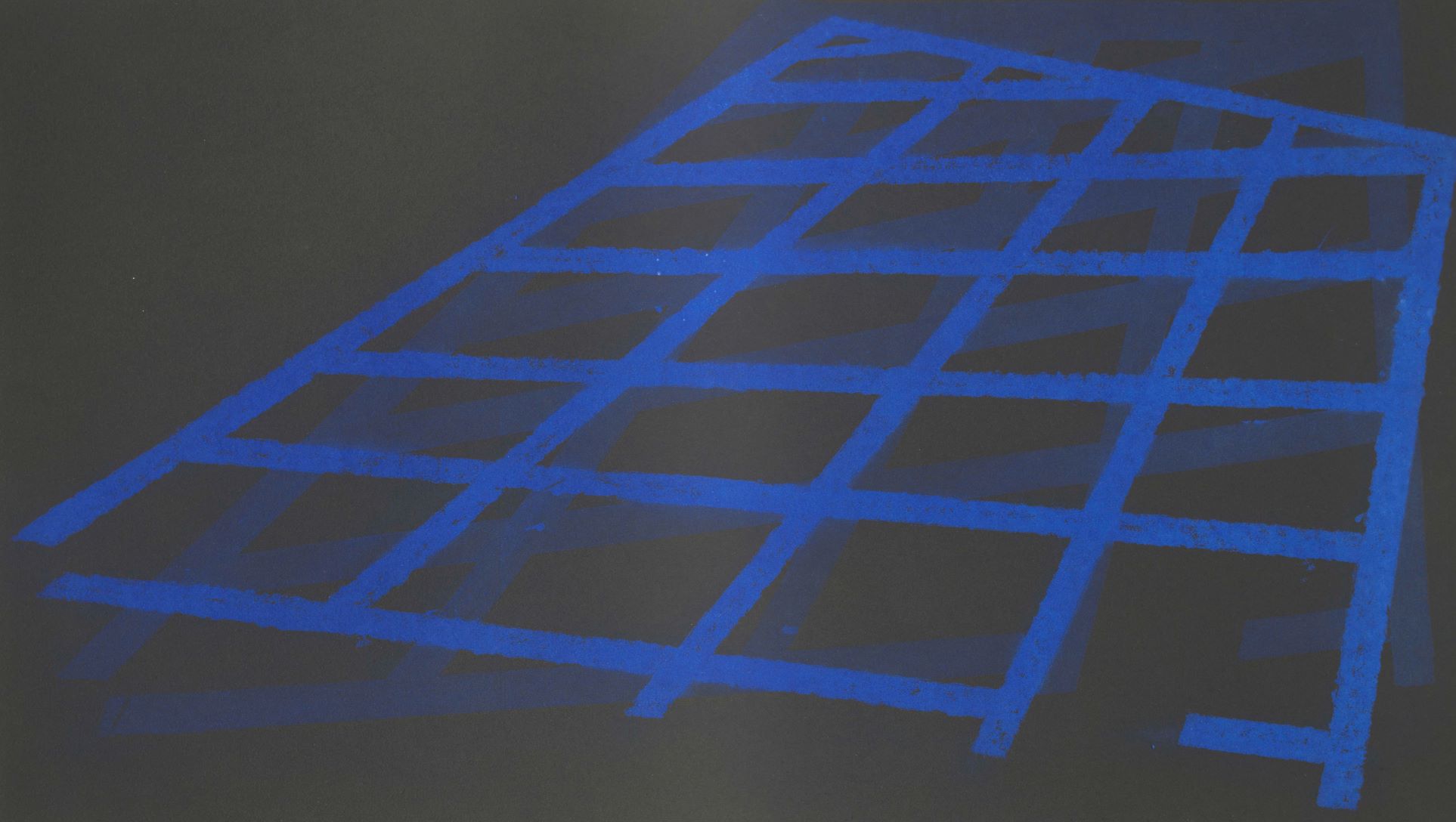
(Aquatint, 2001)
In this extract from an obituary commemorating Philip Reeves, the writer could be describing the above print…
Although landscape figured often, Philip was as much inspired by the city, its high rises, car parks, street furniture […]. There are times when minimal abstraction takes over entirely, exploring geometries and structures for their own sake. Given his emphasis on the self-sufficiency of such subject matter, the opulence of his love of pure colour can seem surprising and stimulating.
Obituary by Christopher Andreae, published in The Guardian on 24th April 2017.
The vivid blue adds an extra level of experience and a new quality of engagement to what would otherwise be a simple urban grid, the colour of which is indeed ‘surprising and stimulating’.
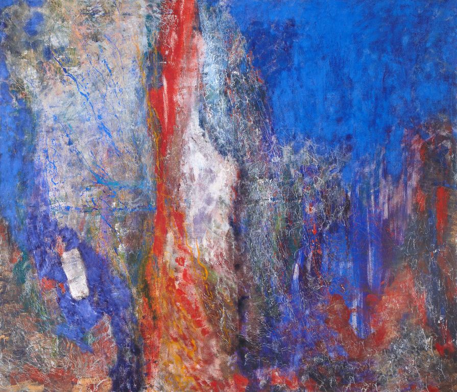
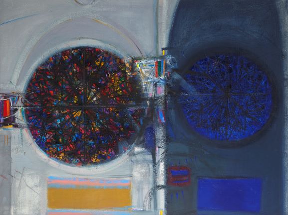
(Oil on canvas, 1991)
In this work too, it is the power and intensity of the blue which strikes one first. The artist Olivia Irvine explains:
The title Stay Blue comes from something my mother once told me: when she first saw the Mediterranean Sea she was so struck by how blue it was that she half expected it to stay blue when she scooped up some in her hands. She knew it wouldn’t stay blue of course, but it was hard to believe because the colour was so intense. I based the painting on that notion and achieved a very intense blue by layering cobalt blue and ultramarine blue oil paint over and over, letting each layer dry first, so it took a while. Cobalt is opaque and Ultramarine is transparent. I offset the blue with reds and oranges to increase the intensity. The whole image is abstract, but refers to the sea and shore, possibly rockpools. On another level it says something to me about things not being as they seem.
Olivia Irvine, 2021
The two blues mentioned here were also employed to striking effect in this work by Patrick Heron.
(Oil on canvas, 1967)
The non-figurative exploration of colour and the effect on the retina of the juxtaposition of pure colour was central to Patrick Heron’s creative process:
‘There is no shape that is not conveyed to you by colour, and there is no colour that can present itself to you without involving shape. If there is no shape then the colour would be right across your retina’.
Quoted in Patrick Heron: St Ives Artists by Michael McNay, ‘ (2002)
Despite the solid shapes and blocks of colour, his works retain a lightness due to the way in which the coloured forms float on and among each other. This painting was one of the first purchased for the Art Collection in 1967. It is currently unavailable to view, though we hope to be able to include it in the exhibition later in the year.
We hope you enjoy the exhibition.